Suppose you wanted to power the world at the level that each human being can enjoy the same level of energy abundance as the average American. And suppose we wanted to do it all with photovoltaic solar energy. What would it take?
There are an average of 250 kilowatt hours consumed per person per day in the United states. Maybe that seems like a lot to you because you occasionally look at your home electric bill and see less than 1000 kilowatt hours used in a entire month for a home that houses four people. That 1000 kilowatt hours for four people in a month works out to only about eight kilowatt hours per person per day. But that electric bill is a very poor indicator of how much energy is actually expended for your benefit. That is why claims that some energy source will power X number of homes is incredibly misleading.
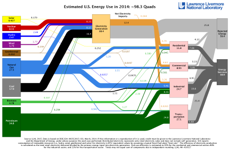
Here is the reality. According to Lawrence Livermore National Laboratory the United States consumes 98.3 quads of energy every year.
That works out to about 250 kilowatt hours per person per day
(98.3 quads/year) x (2.933 x 10¹¹ kw-hr/quad) / (year / 365 days) / (3.2 x 10⁶ people) = 247 kilowatt hours/person/day
Fortunately, this daunting amount of energy is also somewhat misleading. Look at the right side of the graph from Lawrence Livermore. Notice that the two final energy outputs on the right side of the graph are “Energy Services” and “Rejected Energy.” “Energy Services” is energy that actually does some useful work. “Rejected Energy” is energy that is lost, mostly in form of waste heat. For example, if you burn a lump of coal in a steam generator and get a kilowatt of energy out in the form of electricity, but lose two kilowatts in the form of heat to the atmosphere, then you got one kilowatt hour of Energy Service but two kilowatt hours of Rejected Energy. As you can see from the graph, only 40% of the energy that is input comes out the the system as Energy Services (38.9 quads / 98.3 quads).
One of the big advantages of solar photovoltaics is that you don’t lose 60% of your energy to heat. Electric cars put far more of their stored electric energy into useful work (Energy Services) and far less into “Rejected Energy” than do blazing hot internal combustion engines.
Let’s make the assumption for now that every possible efficiency is applied, so that we only need to produce 40% of the 250 kilowatt hours per day per person, or 100 kilowatt hours per day per person. Still a lot of energy, but more manageable than 250 kilowatt hours.
So, for 7 billion people we need 700 billion kilowatt hours per day (100 kilowatt hours per person x 7 billion people). If we got all that energy from solar photovoltiacs, how much land would be required for solar arrays, how much would it cost?
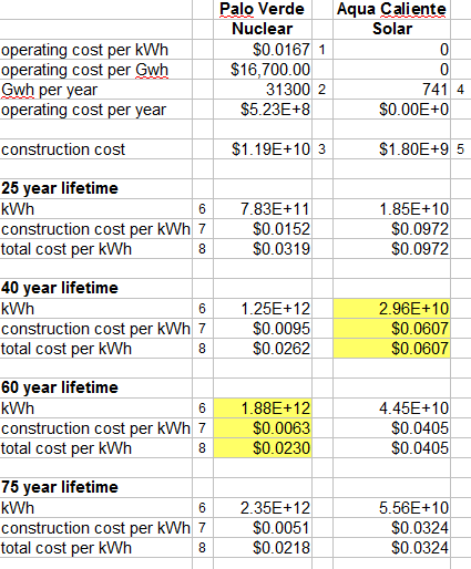
Topaz Solar Farm
To get estimates of these values, we can look at some of the world’s biggest solar arrays. Consider the Topaz Solar Farm in California. It is one of the biggest and one of the newest in the world and in an area of very high solar insolation. It is expected to generate 1,100 GWh of energy per year while occupying 25 km2 with a cost of $2.5 billion. Therefore it would generate the energy consumed by about 30,000 people at 100 kWh per person per day.
(1100 GWh/year)x(1×106 kWh/GWh)x(year/365 days)/(100 kWh/person/day) = 30,136 people
From this it is clear that it would take about 6 million km2 of solar photovoltaics of the Topaz Solar Farm density to generate all the energy consumed by 7 billion adequately powered people.
(7×10⁹ people) / (30,136 people/25 km2) = 5.8×10⁶ km2
Keeping in mind that the Topaz Solar Farm cost $2.5 billion and yields enough energy for 30,136 people, then the cost for 7 billion people would be about $580 trillion.
(7×10⁹ people) / (30,136 people/$2.5×109) = $5.8×10¹⁴ .
For the sake of comparison the, the gross domestic product of the United States is about $17 trillion, or less that 3% of that $580 trillion. The gross product of the entire world is about $78 trillion, or about 13% of that $580 trillion. So, if every penny or mark or yen, etc. of world product for about 7.5 years were dedicated to this project, it could be accomplished.
Some points to consider
What would be the consequences of covering 6 million square kilometers of land with PV? This would be like completely covering an area the combined size of Arizona, Nevada, Colorado, Wyoming, Oregon, Idaho, Utah, Kansas, Minnesota, Nebraska, South Dakota, North Dakota, Missouri, Oklahoma, Washington, Georgia, Michigan, Iowa, Illinois, Wisconsin, Florida, Arkansas, Alabama, North Carolina, New York, Mississippi, Pennsylvania, Louisiana, Tennessee, Ohio, Virginia, Kentucky, Indiana, Maine, South Carolina, West Virginia, Maryland, Vermont, New Hampshire, Massachusetts, New Jersey, Hawaii, Connecticut, Puerto Rico, Delaware, Rhode Island with solar panels. Of course, this would be spread out over the about 100 million square kilometers of land at latitudes lower than about 50 degrees.
This plan would also require a distribution system that could move energy from daytime areas to nighttime areas, or at least a few days of storage for every person on the planet. Such a distribution system is not feasible at this time, and the massive amount of storage is prohibitively expensive.
Two days of storage would be 200 kilowatt hours of stored energy per person. Probably the best mass storage option today (2015) is with Tesla’s Powerwall, which stores 7 kilowatt hours, costs $3,000, and weights 220 pounds. So we would need about $90,000 and about 6,600 pounds of storage for each of the 7 billion people. That adds another $630 trillion to the cost.
These calculations serve simply to give a feel for what could be done with solar photovoltaics and what the limitations might be. I am not suggesting that the world should be powered solely with PV. With other energy sources in the mix less money and land would need to be devoted to PV (but more to those other sources). For example, if you did the same calculations for wind, then you would find that about twice as much area (about 12 million square kilometers) would have to be covered by wind farms to get the same amount of energy. But at least you can grow corn are graze cattle below the turbines in a wind farm.
I have led you to water. It is up to you to drink up your own conclusions about the viability of using solar energy to bring the world up to a reasonable level of energy consumption.