Deception from NASA: Satellites are true cause of sea level rise
June 6, 2011I am old enough to recall the salad days of NASA. Americans of my age vividly remember the scratchy images of Neil Armstrong and Buzz Aldrin on the Moon in 1969 and the pride we felt for our country. In the next few years ten more of our finest put their footprints in the dust of Earth’s one natural satellite.
Now NASA is using its own artificial satellites to raise the sea level.
The basics of the Moon’s effect on the daily oscillations of sea level have been understood since Newton’s Principia. Newton showed that the twice daily tides were caused by the differential gravitational acceleration between the sides of the Earth closest and farthest from the Moon. Newton’s classical explanation is quite adequate for mundane things like tidying up tide tables. But we are in a different age, and the NASA scientists have other things in mind.
NASA’s artificial satellites are now raising the sea level. No coastal city or dweller will be safe if NASA is allowed to go on with this diabolical plot.
Plan to raise sea levels
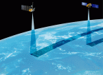
The preliminary steps of this diabolical plot came to fruition in 1992 when NASA lifted the TOPEX satellite into orbit. This single satellite caused an immediate and well documented near double increase in worldwide sea level rise rates. TOPEX was followed into orbit by the Jason-1 and Jason-2 satellites, which managed to maintain the elevated sea level rise rates after TOPEX gave up the ghost. NASA could lift an armada of these satellites into orbit, and then you can kiss Manhattan and Florida goodbye.
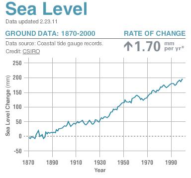
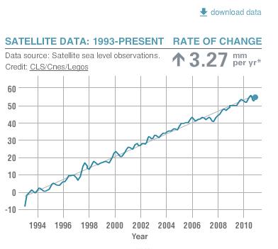
NASA documents reveal the effect of these experiments. The first shows the planet’s sea level prior to the launch of TOPEX and the second shows the Earth’s sea level after the lauch of TOPEX…
As you can see, the instant the satellite goes on line in ’93, the sea level rise rate doubles. Coincidence? I think not!
In the plot below I have digitized the data from the two above graphs and translated them to overlay from 1993 to 2000. The trendlines illustrate the stark reality: coastal cities are doomed unless NASA can be stopped.
Astronauts Fight Back
Harrison Schmitt went to the Moon on Apollo 17. He has a PhD in Geology from Harvard. Here are his comments…
Buzz Aldrin walked on the Moon with Neil Armstrong. He has a PhD from MIT. Here are his comments…
Walter Cunningham was the Lunar Module Pilot on Apollo 7. He has a Masters in Physics from UCLA. You can read his comments here (Houston Chronicle, 8/15/2010).


Cool! I spotted that NASA page only after a detractor linked to it in the comments section of some alarmist news article. I love to follow links to discover what subterfuge they often contain.
More astronauts are here:

I came across this page from a link in one of your previous comments.
Thanks,
Tom
I’ve combined your chart with Church & White’s simple tide gauge average and the latest satellite data:
We see the tidal guages until 1994, but not afterwards. What do they now say.
Or is the tidal guage data now `lost`.
It’s still there, at the lower rate, no acceleration. Pick any station you want http://tidesandcurrents.noaa.gov/sltrends/sltrends_global_station.shtml?stnid=680-140
Another tide gauge archive with plotting and Google maps is here:
http://www.psmsl.org/data/obtaining/
NASA may be able to monkey around with the data and fool those who live inland but they won’t be able to fool those who live around Manhattan or Florida or the west coast of the US if they can see the ocean hasn’t risen to inundate those areas!
Very interesting graphs; but the likely explanation is that the IPCC scientists have decided to use a subsiding Hongkong gauge as reference and add that trend to the Jason/TOPEX data (“Calibrating” they call it i think).
Nils-Axel Mörner has the lowdown.
THE GREAT SEA-LEVEL HUMBUG
There Is No Alarming Sea Level Rise!
by Nils-Axel Mörner
Click to access Morner.pdf
[…] Deception from NASA: Satellites are true cause of sea level rise […]
Satellite maps show a rise of around 8mm per year around Darwin (Australia) since the early ’90s, yet the BOM tide gauge shows more like 2mm, and virtually nothing since 1910. May be isostatic rebound, but glaciers in that part of Oz are not well documented.
ENVISAT
http://www.esa.int/export/esaEO/SEMWYN2VQUD_index_0_m.html
0.88mm/y and levelling,

1.2mm/y raise with all adjustments, also levelling.

NOAA tide measures.
about half mm/y
http://tidesandcurrents.noaa.gov/sltrends/MSL_global_trendtable.html
Can we rely NASA Topex and Jason measures?
No we can´t, they are strongly biased, some 3-9 times what is really measured.
Howdy,
Interesting work on the sea level stuff.
I have a proposal. I noted that you had Vermeer’s and Ramesdorf model both in matlab and apparently your own version.
I think you also did a version that translated sea level into temperature.
I’m wondering if you would share your code. I’d take the code and turn it into R code for everyone to use.
I’ve recently done this with Tamino’s code.
you can email me at moshersteve at g mail
Hi Steven,
I will be happy to share any code that I have.
PNAS archived Vermeer and Rahmstorf code for VR2009. You can get the code here, where you can find a link to the new PNAS archive location, or use my links to the unzipped versions.
I had the same experience as everybody else who tried to run their code. That is, I could not get their single spectrum analysis code to work properly. My feeling was that the focus on SSA was really just a smoke screen anyway. SSA did not do anything spectacularly different than could be accomplished with other smoothing techniques.
So I simply wrote my own LabView code to implement their model as they described it. My code takes a text string consisting of three columns of tab delimited data (year, sea level and temperature) as input. I used the same source of sea level data (Church and White 2006, and Chao reservoir correction) and temperature data that they used. I smoothed each set of data, combined the smoothed Church and White data with the smoothed Chao data and and applied them to my LabView code.
I an happy to share the LabView code. The LabView version that I used is LabView 8.6, but I may downconvert it to LabView 7.1 (which has some ease of use advantages in my opinion). I am also happy to give you my smoothed versions of the input data.
Tom
Almost certainly the satellite sea levels have not had the correct adjustments made and are in fact beginning to show a cyclic trend, hence the recent decrease in the rate. This is why they have created a new fudge factor in an attempt to maintain the AGW tenet. Also keep in mind how a cyclic trend appears when a linear fit is applied, i.e. what is the slope of a sine wave over a complete cycle compared to a partial cycle, compared to the linear trend over a non-integer number of cycles?
Similarly, sea ice concentrations show no trend until the advent of satellite measurements and then a more or less linear decline, almost certainly due to the orbital decay.
[…] Chart: climatesanity.wordpress.com/sea-level-rise/ […]