I would like to make a few comments about the DMI arctic temperature data. I made the numeric version of this data available yesterday by digitizing the yearly graphs available from DMI. I have had a chance to look at the data and draw some initial conclusions.
Anthony Watts, who I have the greatest respect for, presented an animation of the 52 yearly DMI Arctic temperature plots form 1958 to 2009. He said “See if you can spot the temperature spikes or the “…cooling trend reversed in the mid-1990s.” His animation appears below…

Anthony Watts' animation of DMI temperature plots.
As Anthony Watts implied, I found it difficult to detect a trend over time by viewing the animation. So I created a simpler version that shows only five frames, each consisting of an overlay of 10 years, 1958 to 1967, 1968 to 1977, …, 1998 to 2007. The problem is that when I view this simpler animation, I do see a trend, with temperatures rising in the freezing season on the the far left and right sides of the graph in the last frame (1998-2007). My animation is below (double click is the image does not appear animated)…
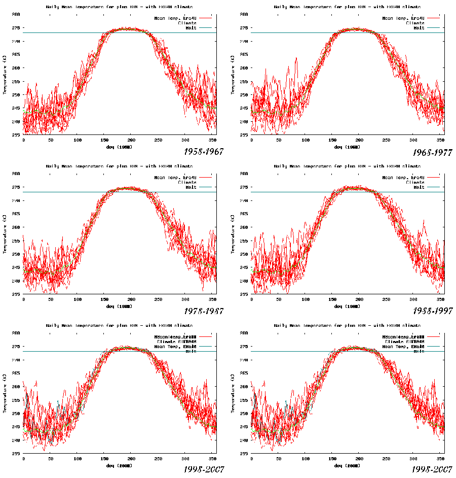
Moriarty's animation of 10 year composites of DMI Arctic temperature graphs.
The data that I made available yesterday gives the DMI Arctic temperature for each half day from 1958 to 2009. This set of data allows a plot of the Arctic temperature for a particular day of the year as a function of the 52 years covered. For example the following two graphs show the temperature on September 1st and October 16th. Notice how the temperature trend seems to increase after 1995 for the October 16th data but not for the September 1st data.

September 1st temperature as a function of year.
.

October 16th temperature as a function of year.
If we are interested in a change of trend after the mid-1990s, then the trend before up to 1995 and the trend after 1995 for every day of the year can be compared in the same way they are compared for October 16th in the above image. The following image shows the temperature trend for each day of the year for 1958 to 1995 and from 1995 to the present.
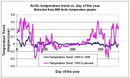
Arctic temperature trends for each day of the year.
.
The total trend for each day for all data from 1958 to present is shown in the following graph.
.

Arctic temperature trend vs. day of the year for all data from 1958 to 2009.
So, the DMI data, presented in the crude fashion that I have used, lends support to the idea that the Arctic has been heating more rapidly since the mid-1990s than before. Those of you who have read my blog in the past know
where I stand on the probability of the Arctic ice melting in the near future, and I stand by my
previous posts. But I think this data must be presented as part of the scientific pursuit of truth.
I would be very happy to hear the opinions of people smarter than me on the significance of this data.



Tom,
It has been my understanding that there has been indeed a noticeable warming of the Artic in the last few years. Your analysis seems to confirm it.
This warming during the winter does cause an increase of the global mean temperature, but it does not cause a threat to civilization in any way.
The issue I have with “arctic warming”, is the warming happens in the middle of winter when its far to cold for ice to melt, there is little trend in summer when ice does melt. Averaging the two creates a warming trend which is misleading as the trend is unrelated to the ice melt season.
in summer any extra heat would go into the melting of ice. As long as there is ice, temperatures will remain around the freezing/melting point. In winter, all the surface is ice, there is no phase transition taking up extra heat so you will see larger variations in temperature. It’s just basic thermodynamics.
hence, more ice melt in summer, higher temperatures in winter, makes perfect sense.
This is a comment from WUWT which might be of interest to you.
matt v. (10:51:18) :
I wonder if anyone in this study group looked at the AMO cycle which also went warm or positive in 1995 . MOC[ Meridional Overturning Circulation] and the Atlantic THC also changed . There is a natural long term warming since the Little Ice Age , but there is also natural cyclic change due to SST changes. This appears to be another doomsday type of study that will be found to be wanting when global cooling becomes more evident the real causes of climate change are better understood and accepted.
Cary,
Thankss for your comment. I am planning on looking at that relationship also.
Best Regards,
Tom
I appreciate this analysis. I’ll be referencing it in a future post on the issue.
Best regards
Anthony Watts
I commented on Anthony’s original posting that recent years clearly showed less cold in the freezing edges of his animation. Thanks muchly for illustrating that observation in a way that I lack the technical skill to accomplish. Interestingly, the midyear near and above freezing period shows no warming, which was where Anthony had focused his attention. Global warming theory expects the greatest warming to be observed in the coldest temperatures, ie – night, winter, and high latitudes. It looks like there is some support here. However, I’m not at all sure that a less cold regime of 1 degree C or so, at 30 degrees or more below freezing has any significant impact on anything. It sure isn’t likely to free the Arctic of ice. Murray
The Y axis on the last graph should say “Temperature Trend (Degrees/year)”
ClimateSanity
[…] by The Diatribe Guy on September 15, 2009 I ran across a recent post on Climate Sanity that I thought was an interesting follow-up to my Arctic update using the RSS anomaly […]
Nice Work.
Let us think… What can melt the arctic ice cap?
1. Air temperature over the ice being above 0 C.
2. Radiant heat transfer from the sun to the ice.
3. Water temperature under the ice being above 0 C.
1. Air temperature rise is almost nil.
2. Radiant heat from the sun changes little and is nil.
3. Water temperature under the ice from undersea volcanoes
and vents could be unknown and needs investigation.
Undersea volcanoes could also contribute CO2,
2) Radiant heat from the sun is not nil. Increased summer ice area melt increases absorbed radiation (loss of albedo).
3) Heat from Atlantic ocean currents is the strongest cause of heat flow into the Arctic.
The reason for the lack of warming in the summer should be obvious.
I have to agree with Jeff – the explanation for lack of warming during the “flatline” portion of your graph is intuitively obvious. I’ve been studying the Arctic for about two weeks. The first time I ran across one of these ‘seasonal temperature anomalies by day of year’ graphs I thought, “WTF?” About 30 seconds later I went, “Duh!”
It’s a cute, simple little logic puzzle that really requires no specialized knowledge.
thanks